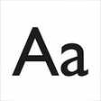
Architectural sans-serif font for high-impact titles
Abastina shapes headlines and short-form branding with geometric, architecture-inspired letterforms drawn from the Mercado del Abasto. The developer Abastina distributes the face in OpenType and TrueType formats for use across desktop design apps and web embedding. It includes 209 glyphs and Western European language support, and targets graphic designers, typographers, and digital artists who need a display face with clear, structural lines rather than a text-family workhorse.
How the font defines display use
Abastina focuses on display roles by optimising its letterforms for titles and short text blocks rather than body copy. The design fuses geometric proportion with architectural motifs, which shows in its angled terminals and generous counters. The source lists a 209-glyph set, a fact that underpins its suitability for posters, editorial headlines, and branding where single-word or short-line impact matters.
What control designers get over typographic detail
The font offers predictable, mechanical structure with a few stylistic variances, including a clean, monospaced-style aesthetic in some variations and geometric proportions across weights. The 209 glyphs cover diacritics needed for English, Spanish, Italian, German, and Dutch, enabling multilingual headlines. Designers can apply tracking, kerning, and standard OpenType features inside Adobe Creative Cloud or other desktop apps to tune display spacing.
Compatibility, installation, and licensing constraints
Abastina installs as standard OTF/TTF files and runs in common design environments, so use in Microsoft Office, web embedding via @font-face, and desktop layout tools is supported. The package is compatible with Windows, macOS, and Linux. The license for commercial use is not included; the font is free for personal use only, and commercial projects require a separate licence from the authors.
A focused choice for designers who need a distinct display face
Abastina is a purpose-built display typeface for designers who want architectural, geometric letterforms for headlines and branding. Its 209-glyph set and cross-platform OTF/TTF support make it practical for short-form typography, but the personal-use licence restricts commercial application without a separate agreement. Use it when you need a visually specific headline voice rather than a general-purpose text family.